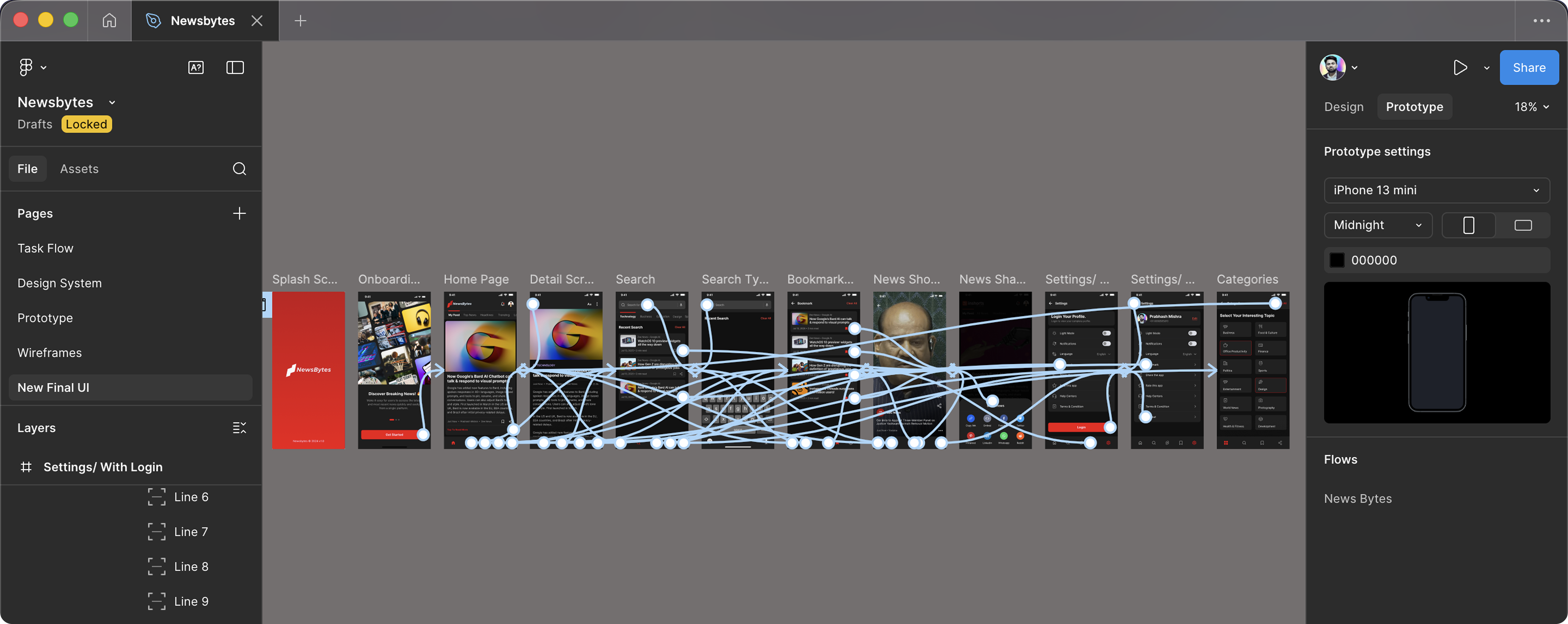
Project Overview
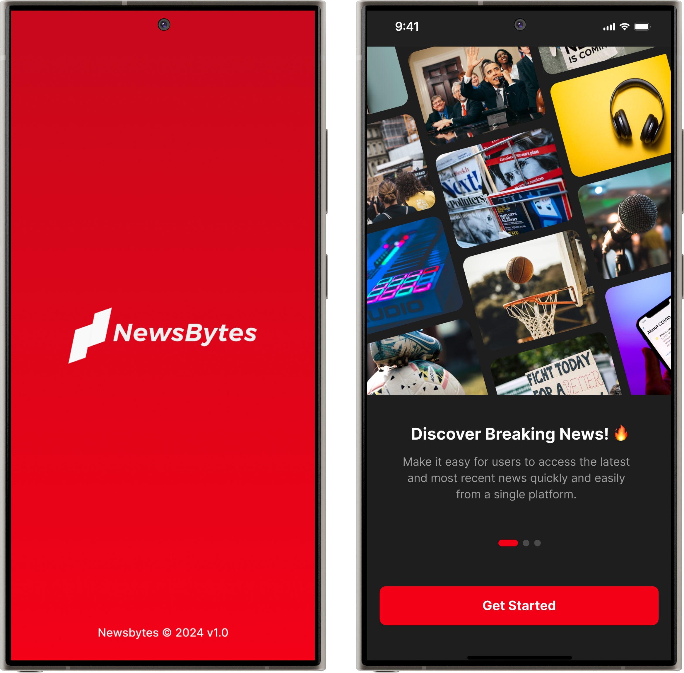
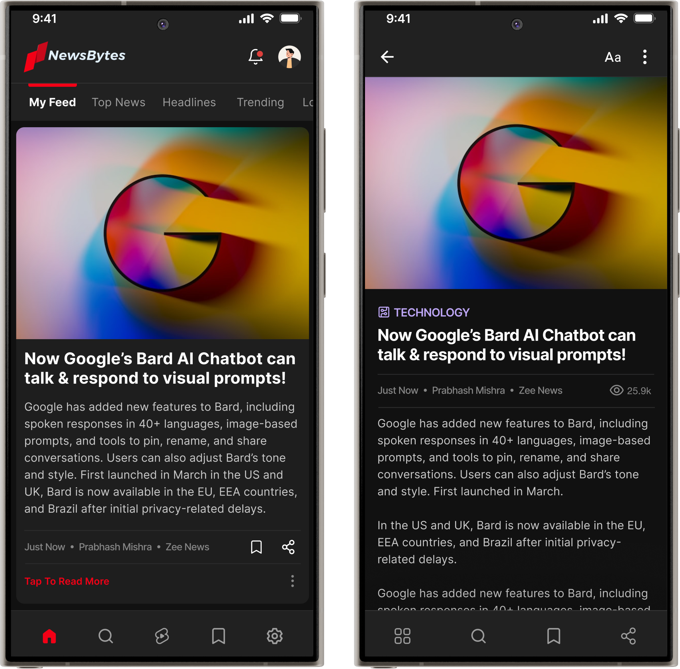
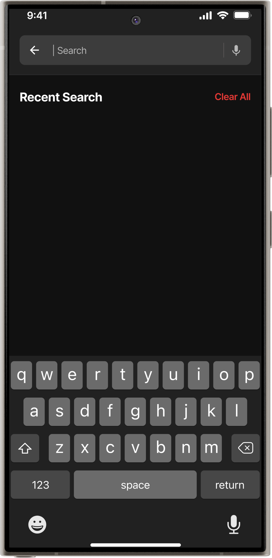
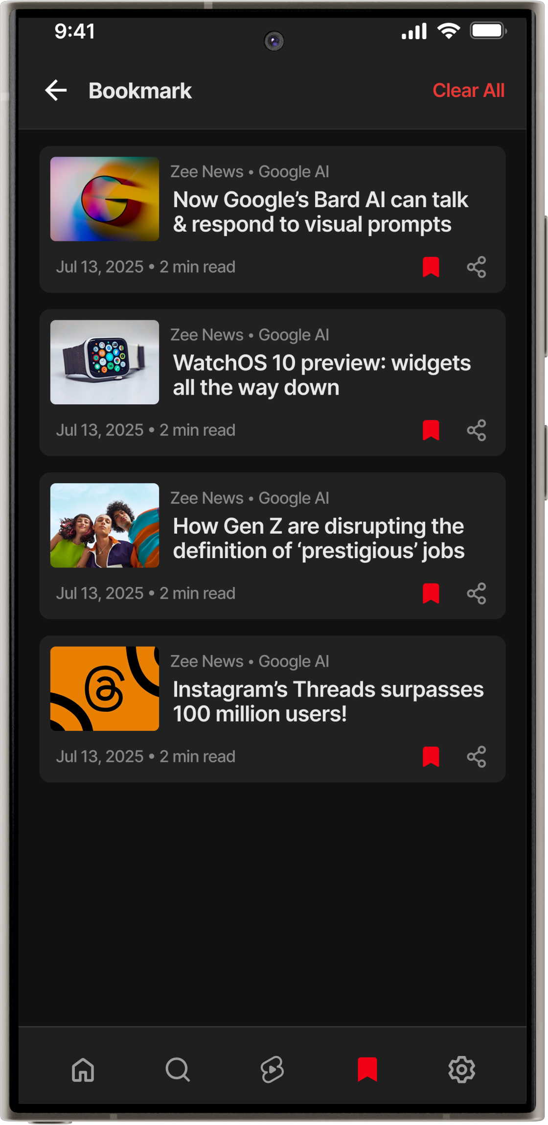
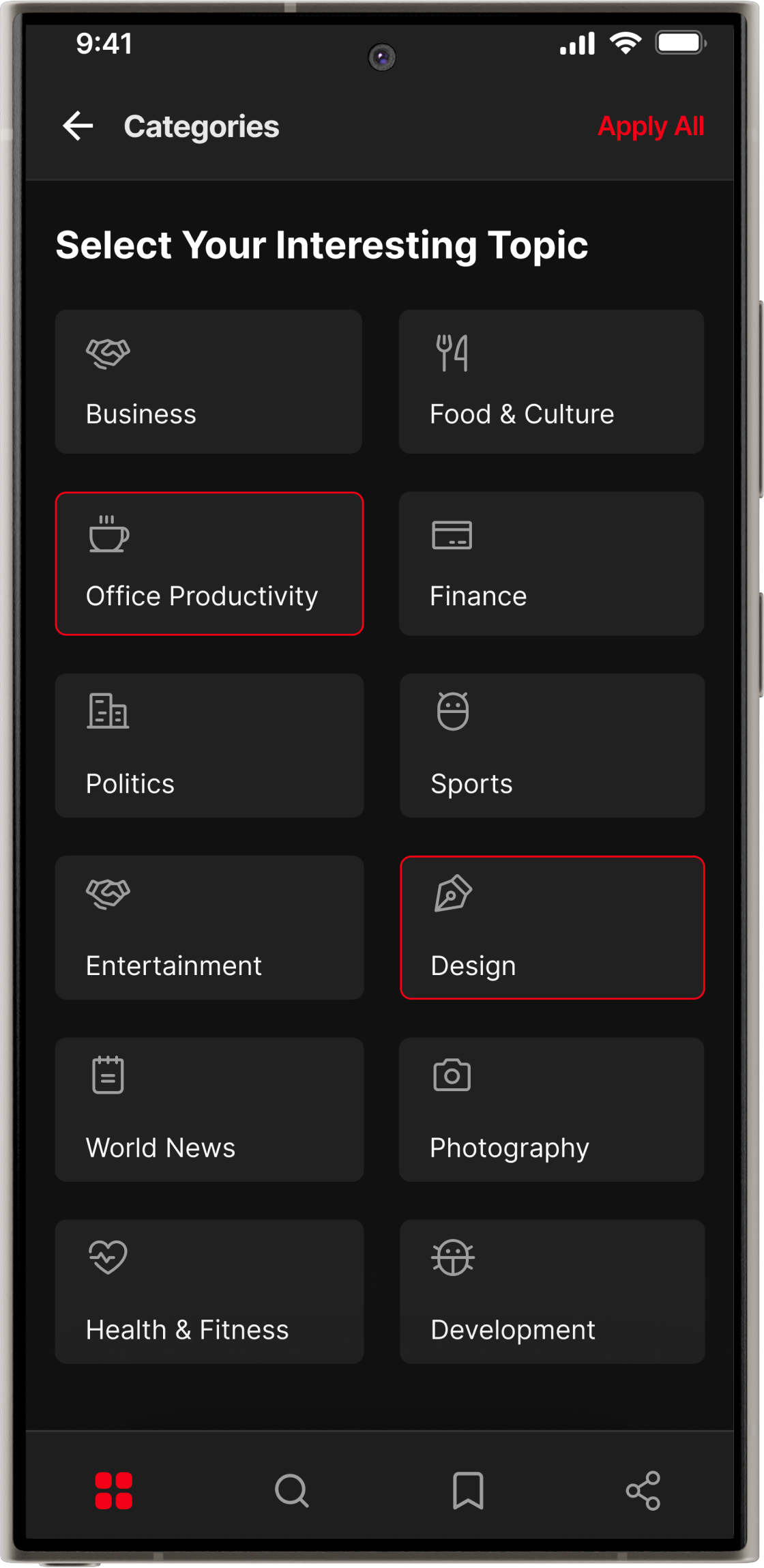
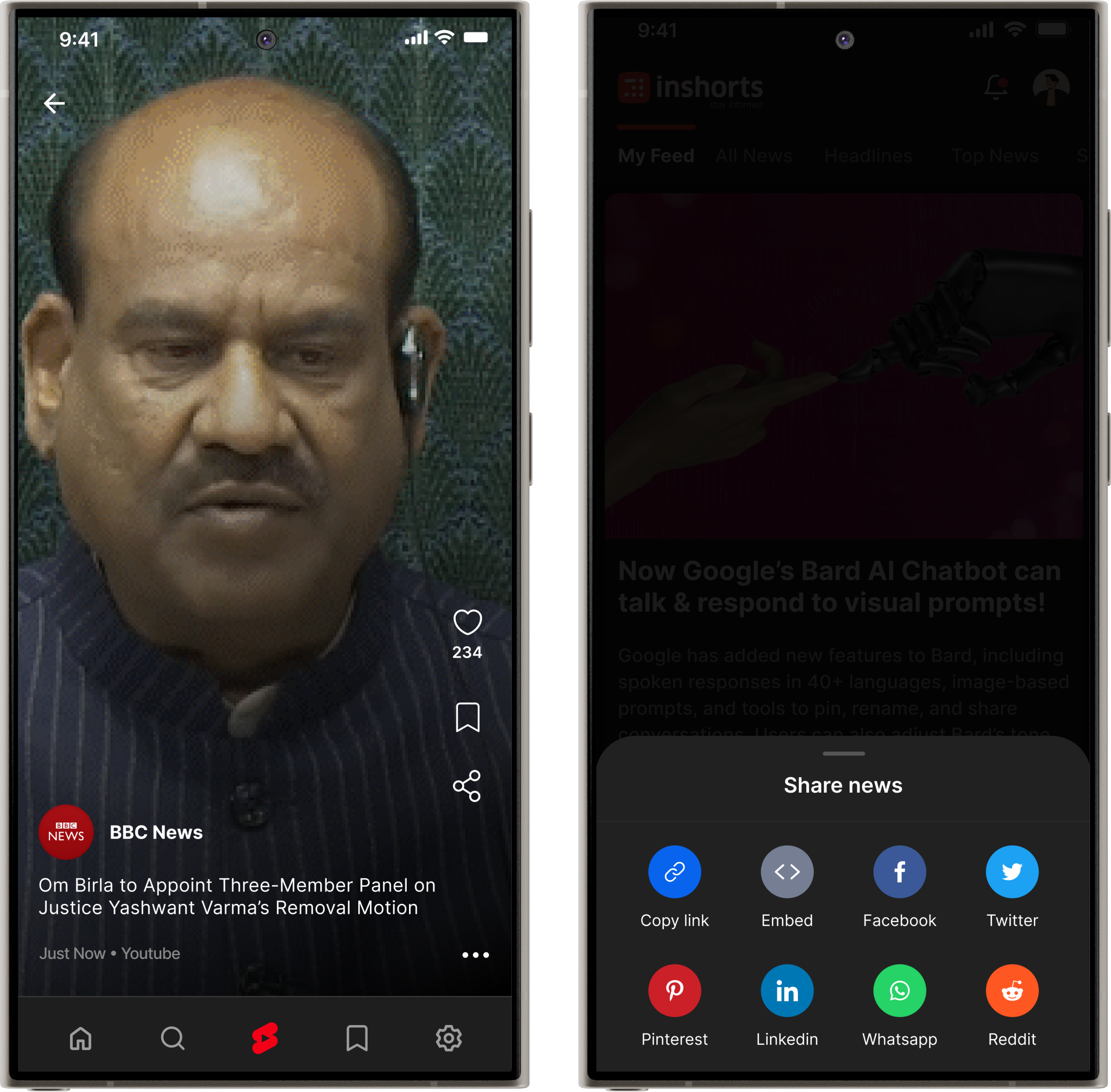
NewsBytes is a redesigned mobile news app offering a faster, cleaner, and more personalised reading experience. I simplified the cluttered UI, improved navigation, and built a scalable design system—delivering a more intuitive and consistent product end-to-end.
About NewsBytes
NewsBytes is an Indian media-tech company that uses AI to create concise, contextual news for its platform and partners. Founded in 2015 by IIT, IIM, and Ivy League alumni, it aims to reduce information overload by delivering precise short(50 to 60) words news with essential background context.
Problem & Solution
Problem Statement
The existing app experience suffers from several UI/UX challenges, including complex navigation, a cluttered interface, inconsistent design patterns, poor content formatting, and minimal personalization, missing valuable features—resulting in a fragmented and frustrating user experience.


Solution
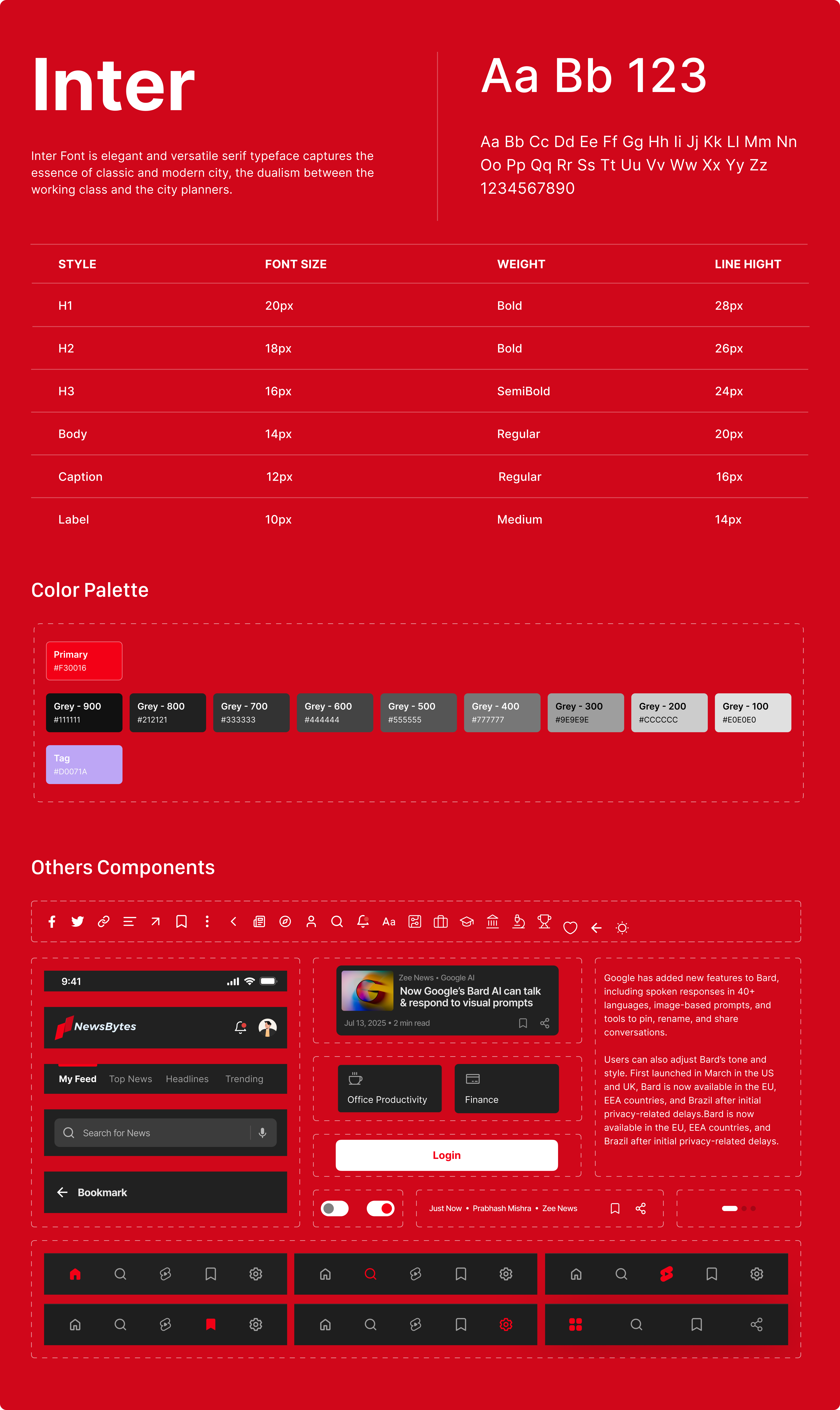
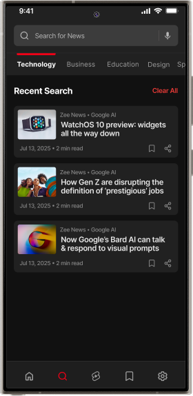
I redesigned NewsBytes to deliver a cleaner user interface, faster, and more personalised reading experience with improved readability, simpler navigation, and a consistent design system and add valuable features creating a seamless and engaging modern news app, so that user can feel a amazing user experience.
Process Highlights
Research & Analysis
Product Designer
Project Team
4 Members
Timelines
4 Weeks
Tools Used
Figma, Notion, Jira, Meets
Design Process

Discovery Phase
To effectively redesign the NewsBytes app, I began with an in-depth discovery phase to understand the product, user behavior, identify usability issues, uncover missing features in the existing app.
User Interviews
Conducted interviews with 6–8 users in-person and 2–4 via phone of news app users (ages 18–60) including professionals, retired individuals, and students, to understand their habits, needs, and frustrations with the NewsBytes. We got the following insights from them.
Users expect a clean and intuitive navigation flow where top stories, categories, and personal interests are easy to access without scrolling through cluttered screens.
Users expect a clean and intuitive navigation flow where top stories, categories, and personal interests are easy to access without scrolling through cluttered screens.
Users expect a clean and intuitive navigation flow where top stories, categories, and personal interests are easy to access without scrolling through cluttered screens.
Competitive Analysis
Analysed top competitors to understand their strengths, weaknesses, and the user experience standards that NewsBytes must meet or exceed.

App Review Analysis
Analysed App Store and Play Store reviews to uncover real user frustrations, feature requests, and usability issues.
Heuristic Evaluation
Conducted a heuristic evaluation using Nielsen’s 10 principles to identify major UX issues such as inconsistent navigation, weak feedback, and poor error handling.

Key Problems Identified after Heuristic Evaluations.


